CASSANDRE, ARCHITECT OF VISION: Geometry as the Foundation of Modern Poster Design
- ROLAND MOURON
- 2 juil. 2025
- 3 min de lecture
Dernière mise à jour : 9 juil. 2025
A.M.Cassandre did not draw by instinct. Trained in architecture, nourished by Cubism and influenced by Bauhaus thinking, he conceived his posters as complete geometric systems. His work, far from personal lyricism, obeyed an imperious logic: to build in order to communicate. Behind each image, a plan. Behind each plan, a thought.
I. Rigor as inheritance: from Auguste Perret to the poster
Before becoming a poster artist, Cassandre was a painter trained at the Académie Julian. There he discovered architecture, which he later considered as the superior art. It is no coincidence that his house-studio in Sèvres was designed by Auguste Perret, one of the great theorists of exposed structure. As the latter wrote: "Architecture is the art of making the supporting points sing."
This experience was foundational. Cassandre discovered that beauty does not come from decoration but from the framework. From then on, his posters became blueprints, constructed with square, compass, and protractor—an engineer's vocabulary in service of a visual vision.
II. The Cassandre method: system, module, monumentality
Functional geometry
In a text published in 1926, Cassandre asserted that the poster cannot be a lyrical or expressive work: "The poster is a mass-produced object, intended to fulfill a function."
His approach was radically anti-individualistic, influenced by Cubism and the communitarian thinking of the Bauhaus. He rejected style as signature, preferring logical construction to graphic virtuosity. He wrote: "Faithful to my geometric method, or more precisely architectural, I strive to ensure my posters have an undeformable 'solid foundation'."
To his draftsman, he imposed a repeated module that structured the entire composition. He forbade the squaring method: rigor took precedence over adaptation.
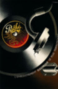
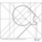
L'Intransigeant: the masterpiece of the system

A foundational poster, L'Intransigeant (1925) embodies this thinking. Every line is deliberate, every tension calculated. The elongated neck of the figure forms a dynamic vector, the telegraph wires converge toward the ear, the mouth is inscribed in a perfect circle, and the entire head within a square.
III. The architecture of the word: letter and composition
For Cassandre, the poster always begins with the text. The word precedes the drawing. It is the letter that, in his words, "sets in motion the mechanism of mental creation."
His typography, which he wanted to be monumental and lapidary, drew inspiration from ancient inscriptions. He rejected lowercase letters, considering them as "manual deformations of the monumental letter."
The poster thus becomes a space rhythmed by the word, like a facade by its openings.
IV. Modern rhythm: from Le BUCHERON to the machine
Cassandre considered advertising as an urban fresco. He wanted to break away from the small sidewalk poster. In his view: "The 80 x 120 is nothing more than a business card."

With works like Le Bûcheron or L'Étoile du Nord, he conceived the poster as a repeatable motif, a "monumental wallpaper" whose repetition produces a rhythm, an urban cadence.

The choice of subject is never decorative: it is about translating a function, a clear idea, with the force of line and the precision of stroke.
V. From calculation to icon: geometry and timelessness
In the 1930s, stylistic evolution was accompanied by a softening. But Cassandre never abandoned his system. Even in more "sensual" compositions, geometry underlies the drawing. Starting with L'Atlantique, Normandie, Dubonnet, Nicolas, he combined rigor and humor, system and style.
"He subjects everything to geometry, but the geometry is not visible. It guides." (Alain Weill)
VI. Conclusion: The constructed gaze
The poster, for Cassandre, is neither a painting nor an anecdote. It is an edifice of signs, a mental and graphic construction. He implemented an aesthetic of refinement, a discipline of line, an intelligence of form. What he sought was the clarity of an order perceived by the crowd, not the expression of a self.
"Always more sensitive to form than to color, to composition than to detail [...] I find myself, as a poster artist, remarkably at ease." (A.M.Cassandre, 1926)
📚 Sources
Henri Mouron, Cassandre, Schirmer Mosel
Alain Weill, interviews (compiled excerpts, 1985-2023)
Geometric analysis of L'Intransigeant, ATELIER Cassandre
Original texts by A.M.Cassandre, Revue de l'Union de l'Affiche Française, 1926
Sylvia Colle-Lorant, Thesis on Cassandre
📌 To go further:
Discover the complete history of the Dubonnet poster in our gallery.
Learn more about A.M.Cassandre's life and graphic innovations.
Explore other iconic posters in the original poster gallery.
✍️ Editorial content from cassandre.fr – reproduction prohibited without authorization.